Qualitative vs Quantitative Interpretations
- GavinOnTheMoon

- Jul 21, 2020
- 2 min read
Updated: Jul 22, 2020
Sooooooooo I am at a cross roads in my thoughts deciding how to present and interpret my results. I am in the works on writing a paper on my Holuhraun lava flow-field research, but I have hit numerous thought walls and writers blocks. This has mainly happened because I have been struggling to figure out how to present and interpret my results. It was not until after I had a meeting with my supervisor and two of my paper co-authors that I got an idea on how to create a general structure for my results and discussion section. Before, I focused entirely on how to interpret my results quantitatively, but never qualitatively. Normally in science, we use qualitative results to get a general understanding of data sets and images, but rely on quantitative results to make strong correlations and interpretations. At the meeting, I was given the idea to investigate whether we can actually distinguish lava flow types using quantified results and statistic correlation tests.
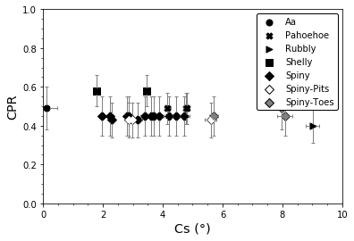
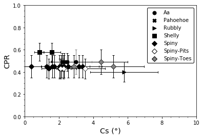
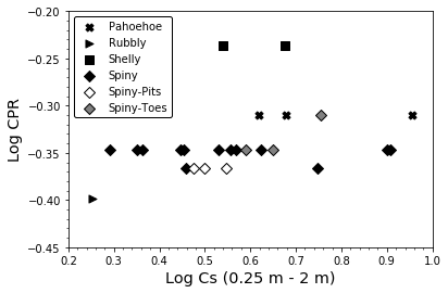
My preliminary results have not shown much promise in comparing lava flow types at Holuhraun. At the moment, I have compared circular polarization ratio and RMS slope (Cs) data, and they show no linear relationship. I even looked at the logarithmic distribution of the CPR and Cs data to see if there was a logarithmic relationship...nothing came up.
Decimetre-Scale Roughness (0.25 m - 2 m)
Centimetre-Scale Roughness (0.05 m - 0.25 m)
Decimetre-Scale Roughness (0.25 m - 2 m) (Log)
Centimetre-Scale Roughness (0.05 m - 0.25 m) (Log)
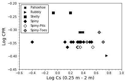
The log plots are solely me playing around with my data and trying to see if any relationship exists. Right now, I do not plan on using these plots for me paper.
What is weird about these plots is when we look at a threshold map we can clearly see differences between some of the lava flows types. Yet quantitatively, no strong correlation.

CPR threshold map over Sentinel-1 imagery covering the lava flow types present at Holuhraun.
Looking at the plots you can say with confidence that there is no relationship between the two variables. However, I want to prove it running statistic tests. I am looking into running Pearson, Spearman, Kendall and T-tests. I use Python matplotlib to plot my data so I will have to write out scripts to create correlation heatmaps so I can confirm whether or not a linear relationship does not exist. An example of what these correlation heatmaps will look is below.
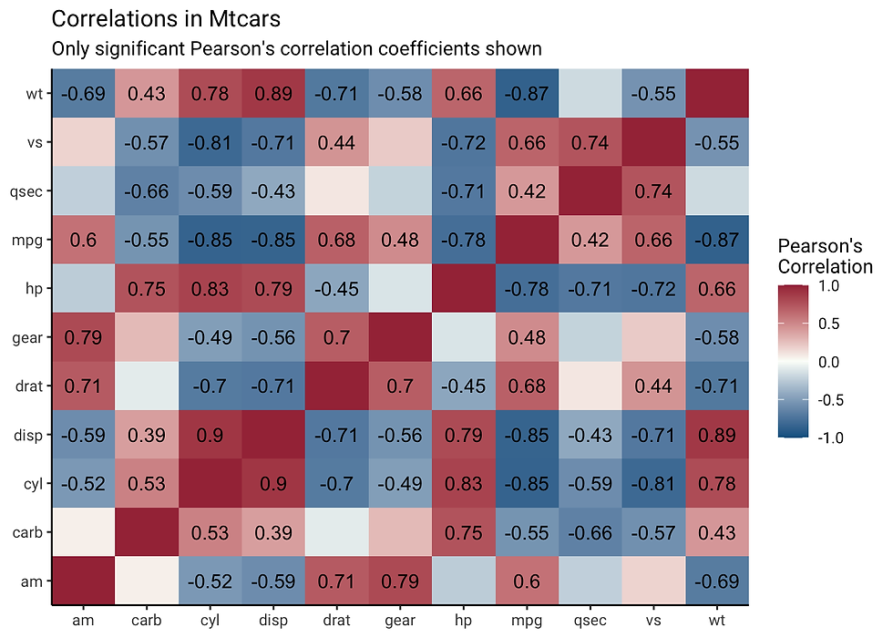
I am not familiar with Kendall tests and I only know T-tests by name. The most I know about Kendall tests is that it is a rank correlation coefficient and used to measure the ordinal categorization between two measured variables. A T-test all I know is that it is a nonparametric hypothesis test. You can see that I definitely need to complete more background reading to ensure I am using the right tests and to grasp a good understanding of the results.
This blog is very short because I have only just started looking into these statistic tests. I wanted to show you all some results but I still need to write out the Python scripts and look for some statistics textbooks on my university library website.


Comments